1. Project Overview
Description:
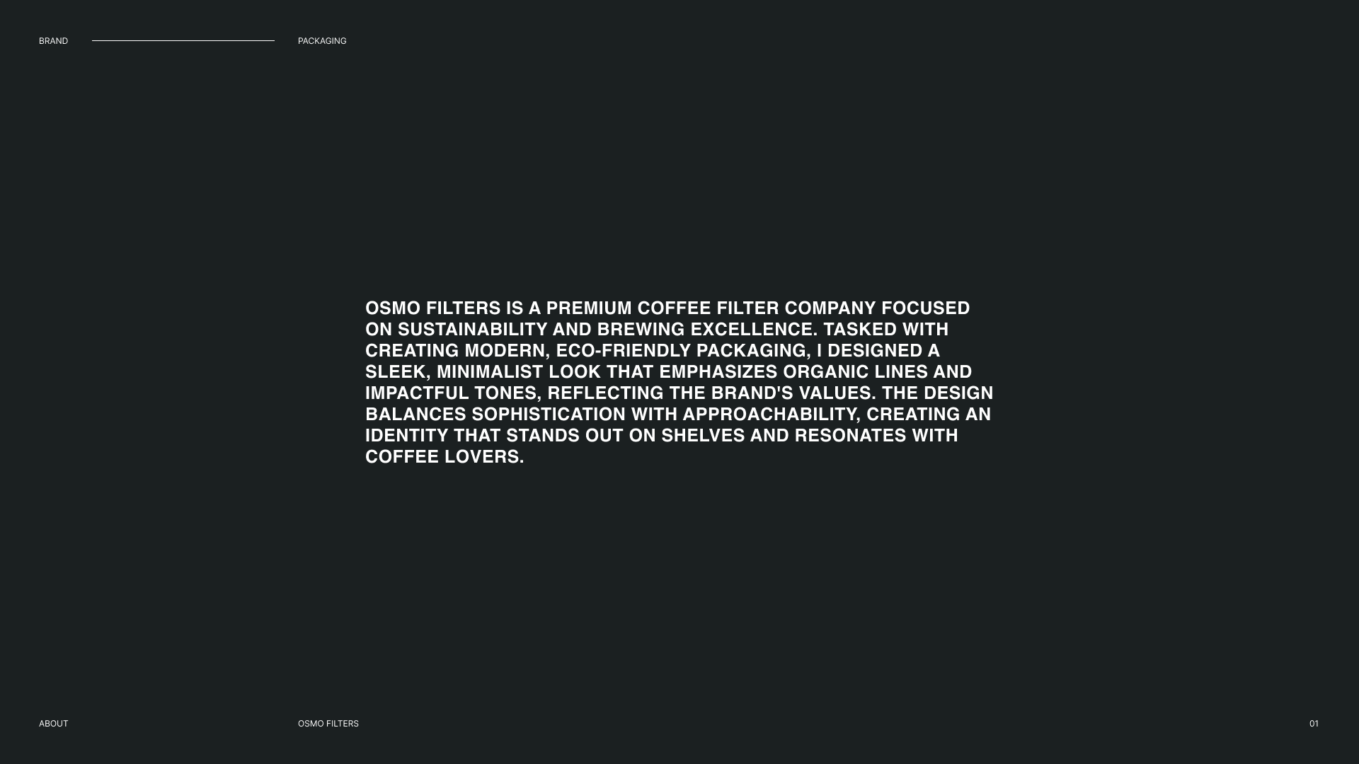
Osmo Filters is a coffee filter company specializing in premium, eco-friendly coffee accessories. The goal was to create a modern and sleek packaging design that reflects the brand’s values of premium, high-quality coffee brewing, and a cutting-edge approach to design.
Osmo Filters is a coffee filter company specializing in premium, eco-friendly coffee accessories. The goal was to create a modern and sleek packaging design that reflects the brand’s values of premium, high-quality coffee brewing, and a cutting-edge approach to design.
2. The Challenge
The company sought to differentiate itself in a crowded market of coffee accessories by creating a unique, eye-catching packaging design. The packaging needed to:
1- Stand out on retail shelves.
2- Appeal to coffee enthusiasts who value quality and sustainability.
3- Reflect the modern and eco-conscious ethos of the brand.
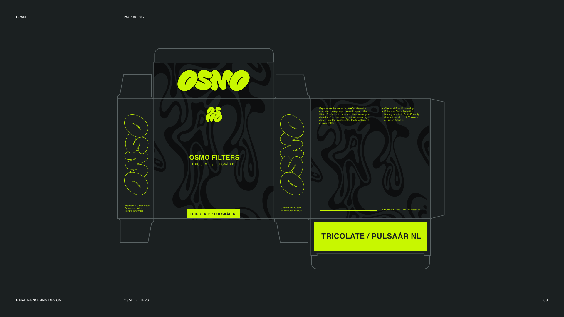
3. The Solution
I developed a bold, minimalist design using a striking black and neon green colour palette to evoke a modern, high-tech feel. The contrast of black and neon green not only makes the packaging visually stand out but also connects with the brand’s youthful, energetic identity.
Key design elements included:
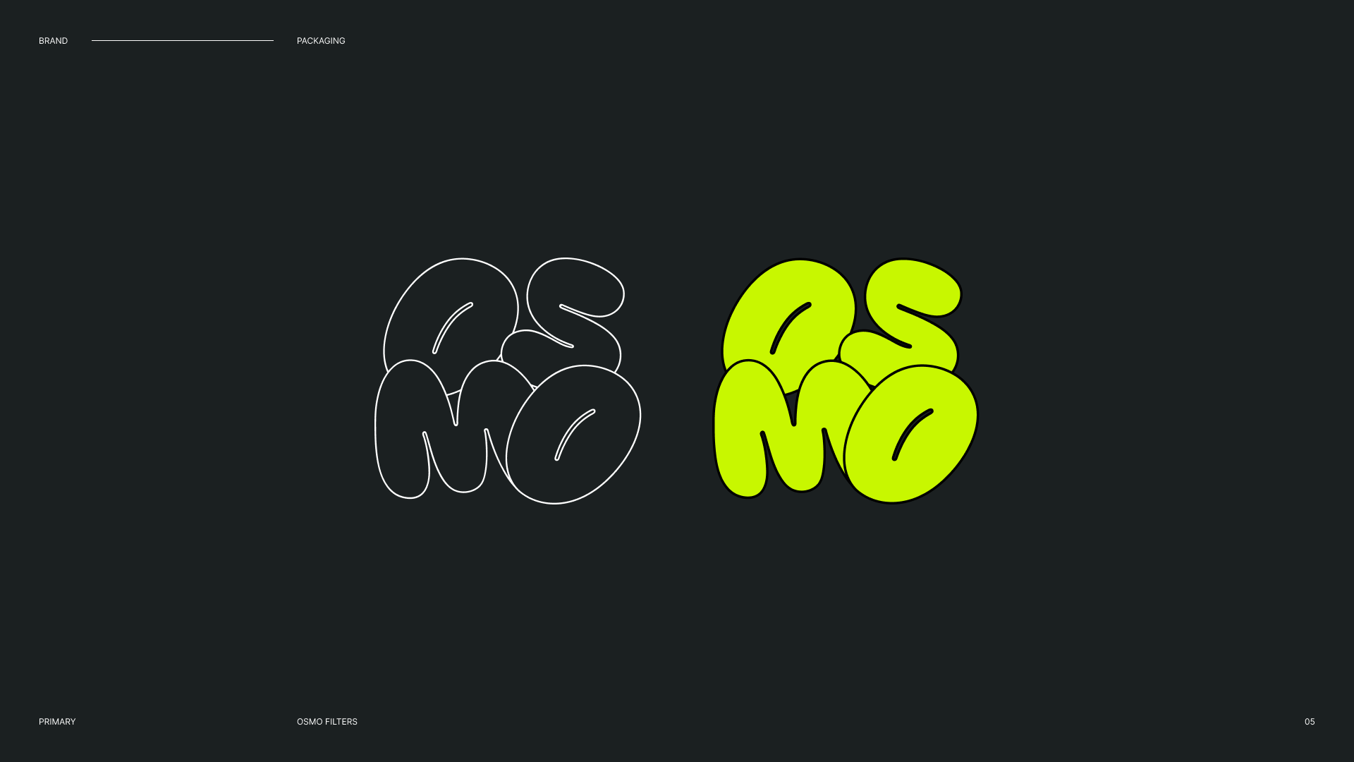
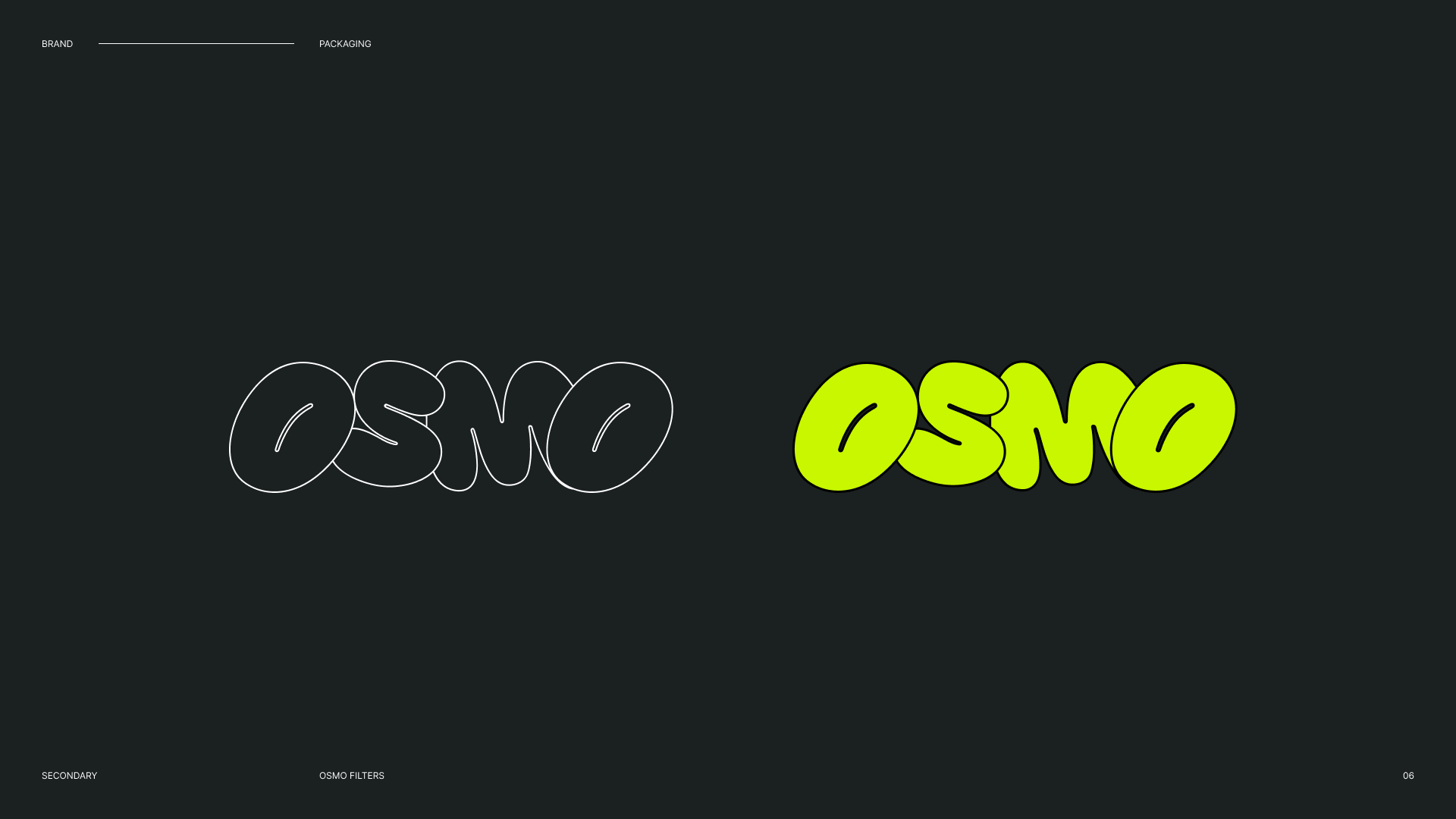
Logo: A clean, modern logo design that aligns with the brand’s premium and sustainable image.
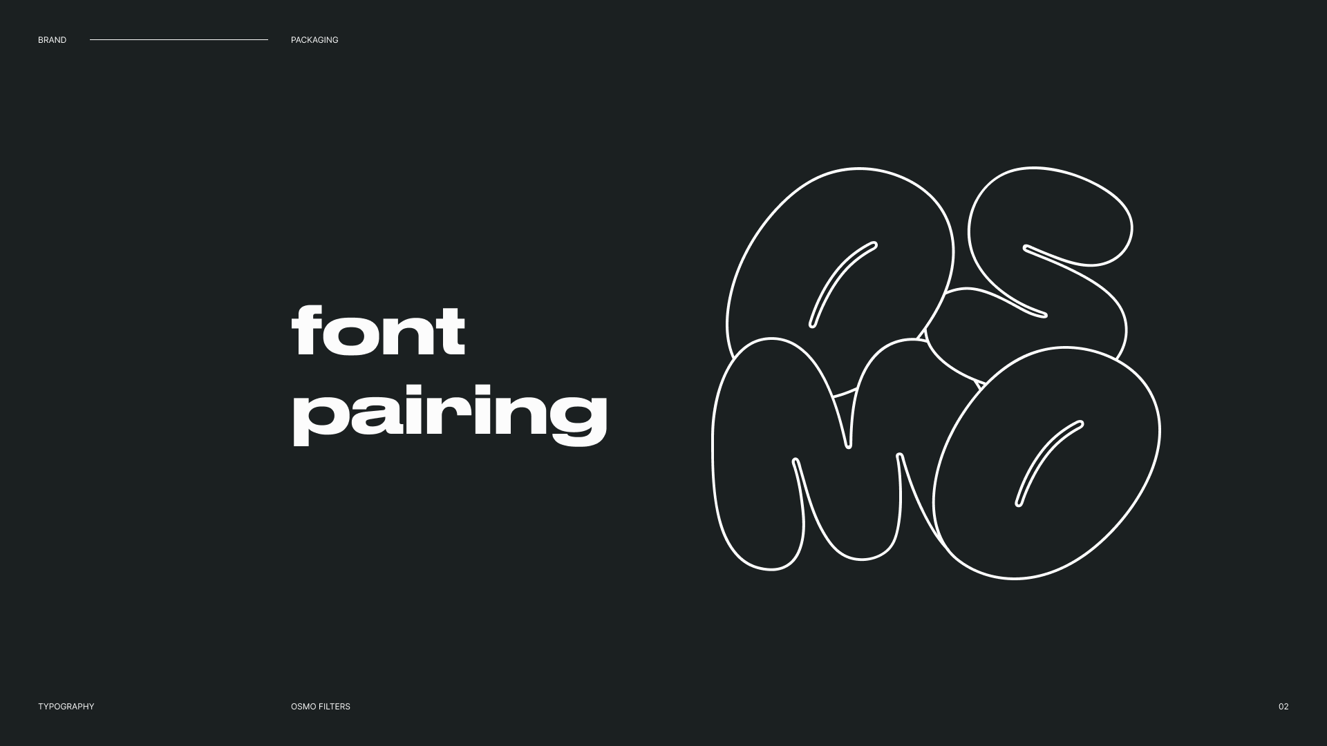
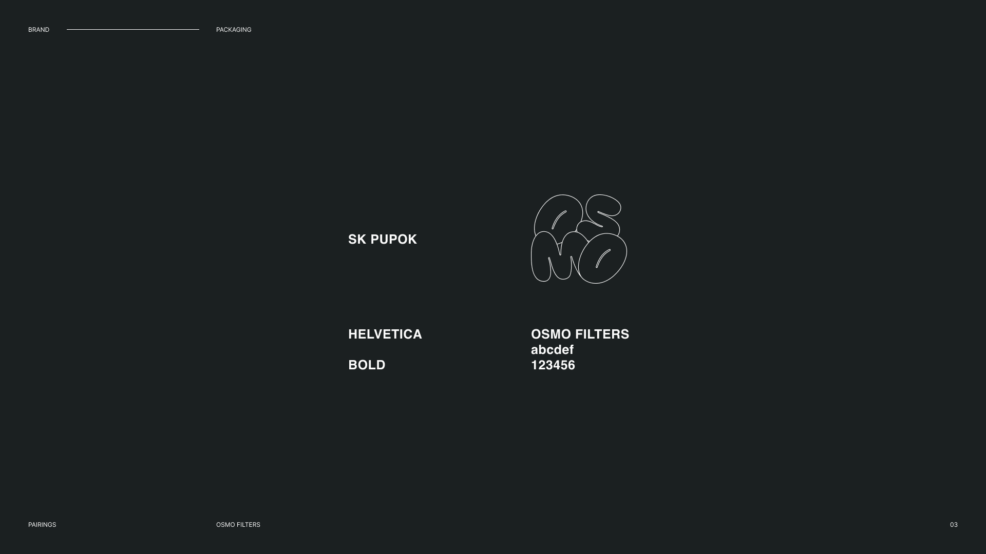
Typography: Sleek, modern fonts paired with a large bubble font in neon green accents to highlight key messaging.
Packaging Design: The design incorporates simple yet effective elements such as organic curves and negative space to allow the product to shine.
Iteration & Refinement: I worked closely with the client to refine the concept, adjusting the balance of colours, typography, and logo placement to create a visually cohesive package.
4. Design Process
Research & Moodboarding: I conducted market research to understand competitors and identify design trends within the coffee filters industry. I developed mood boards to explore various visual directions, focusing on minimalist aesthetics and sustainability.
Sketching & Conceptualizing: Initial sketches and concepts focused on balancing boldness with clarity, ensuring the packaging design communicated the brand’s key values.Iteration & Refinement: I worked closely with the client to refine the concept, adjusting the balance of colours, typography, and logo placement to create a visually cohesive package.
5. Final Outcome
The final packaging design features:
Bold Black Base: Serving as the primary background to add sophistication and contrast.
Neon Green Accents: Highlighting the brand name, product description, and eco-friendly aspects.
Sustainable Messaging: Clear indication of the company’s commitment to sustainability, with a clean and minimalist layout that’s easy to read.
The packaging effectively captures the essence of Osmo Filters, standing out in a retail environment while maintaining a sleek and premium feel.
6. Impact
The design has received positive feedback for its eye-catching, premium look, and its ability to resonate with coffee enthusiasts. The packaging has successfully contributed to differentiating Osmo Filters in the market, supporting the brand’s image as a modern and environmentally conscious coffee filter brand.
7. My Role
I was responsible for the entire design process, from initial research and concept development to final execution of the packaging design. This included creating the logo, selecting typography, and overseeing the design implementation across various packaging formats.